Begin Gin redesign
-
Brand + Package design
-
3D
-
Creative Direction
-
Illustration
-
Lettering
-
Strategy
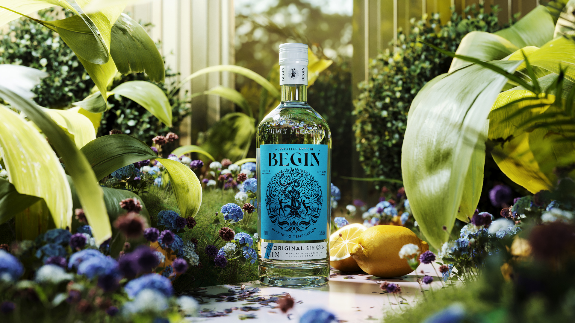
The start of something special
The gin market is highly competitive, with the major players battling craft distillers to win the hearts and minds of consumers. On this battlefield, Begin was neither one nor the other – not a big heritage brand; not a small batch product with a unique story behind it.
The product name wouldn’t be changed, so we explored other ways of giving Begin meaning and how the supporting narrative would convey that meaning. During our research, we considered a wide variety of notions about how stories begin and where they lead.
They included origin stories from other cultures, and in literature, like the idea that the earth is carried on the back of an enormous cosmic turtle. We looked at water as a building block of life, the Big Bang as the start of the universe and how a butterfly flapping its wings in Asia might have consequences in South America. Visual approaches were developed support each story.
Eventually, we narrowed our thinking down to four potential routes, each of which would support one core concept – that Begin represents ‘the start of something special’.
A lasting impression
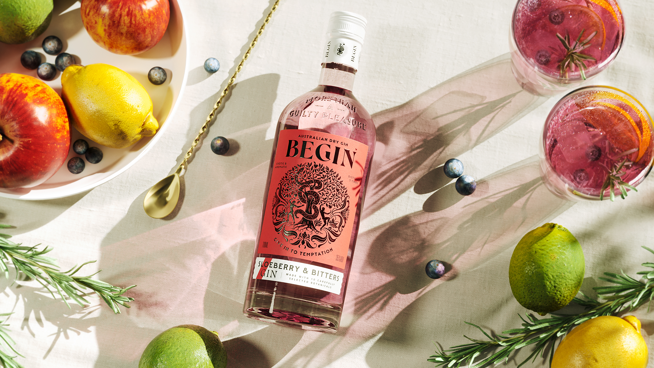
Edgemill embraced the Adam and Eve concept, recognising its potential for greater elegance, intrigue, and emotional depth. Our challenge was to draw out these qualities—visually and narratively—by spotlighting the most evocative elements of the myth.
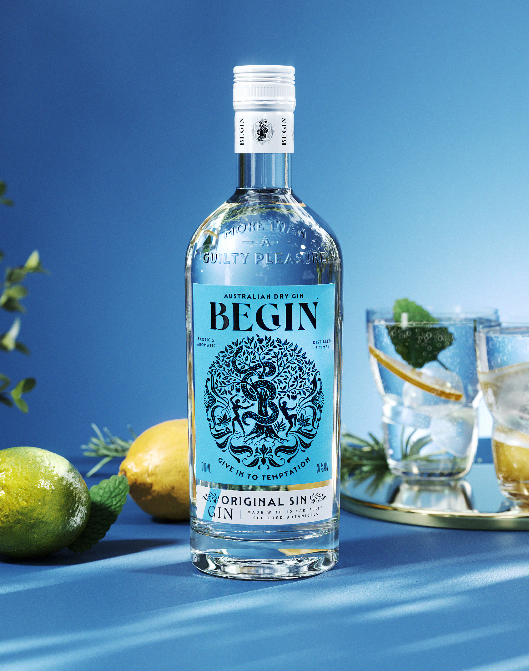
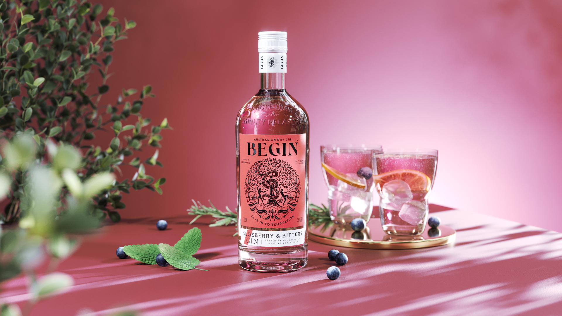
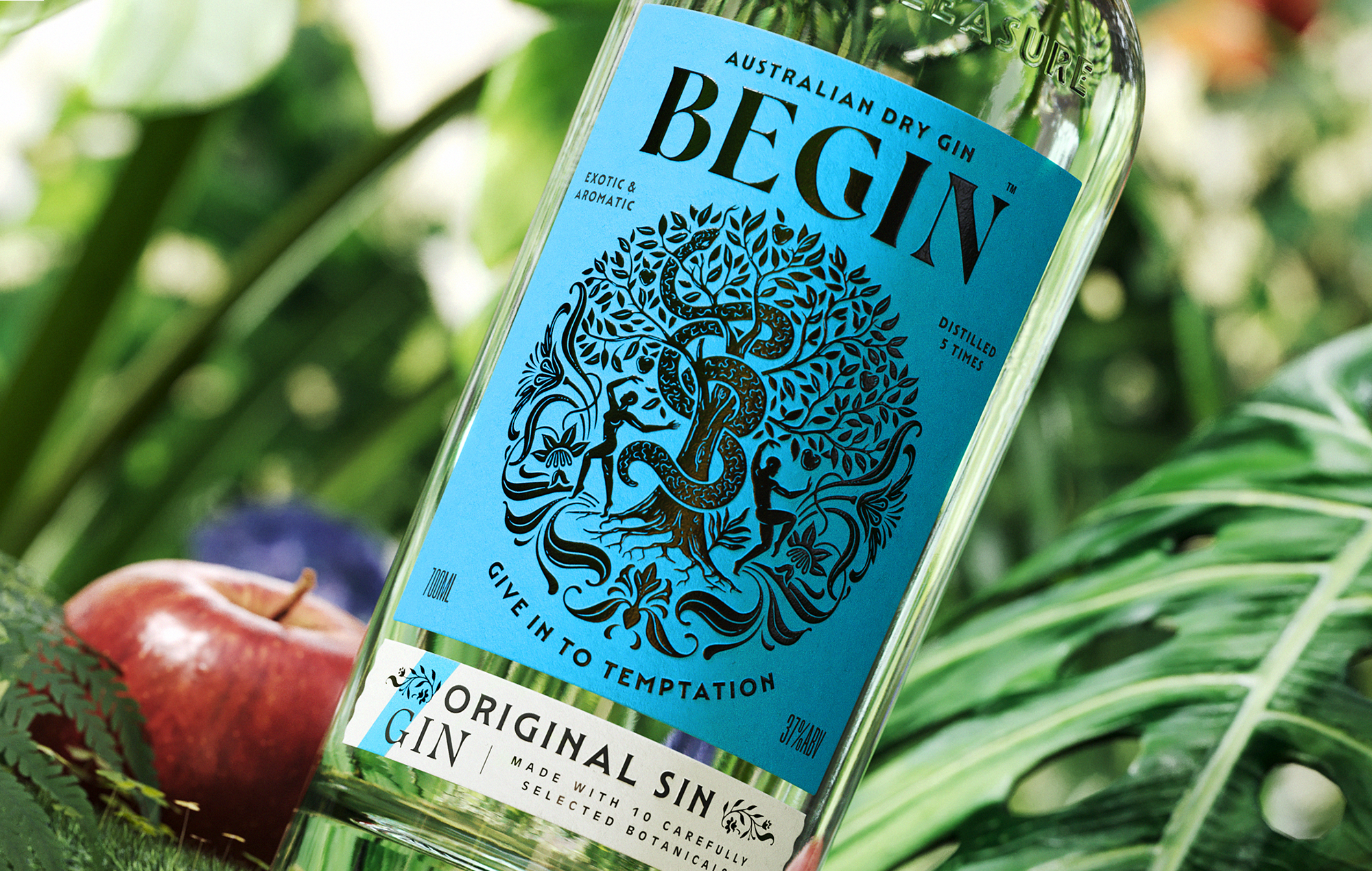
To enrich the experience for the consumer, an ornate illustration was developed, depicting Adam and Eve dancing around the tree of life. Supporting the tagline ‘Give in to temptation’, the writhing serpent presents the forbidden fruit—its body subtly coiled into the shape of a ‘B’, adding a layer of brand symbolism and hidden meaning.
Art deco and impact
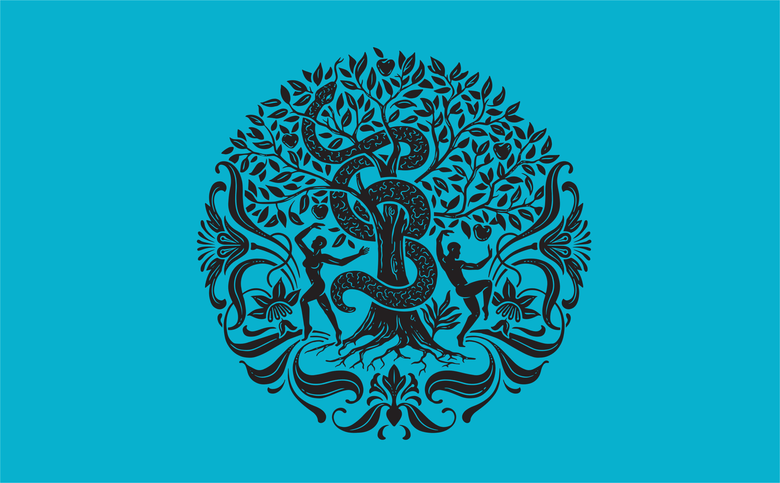
The silhouetted illustration is more than just a centrepiece for the label. Its Art Deco look is echoed in the typography with hand-drawn logotype. High contrast, with unusual details like the dipping stroke in the centre of the B and the bottom right flourish on the G, give Begin another point of difference.
The level of detail in the illustration and the typography have been carefully balanced so that it never leans too far into the past. Though Art Deco-inspired, the vibe is fresh and modern. Mendl Serif as a header typeface provides impact and character on the label; it’s also particularly effective on the website.
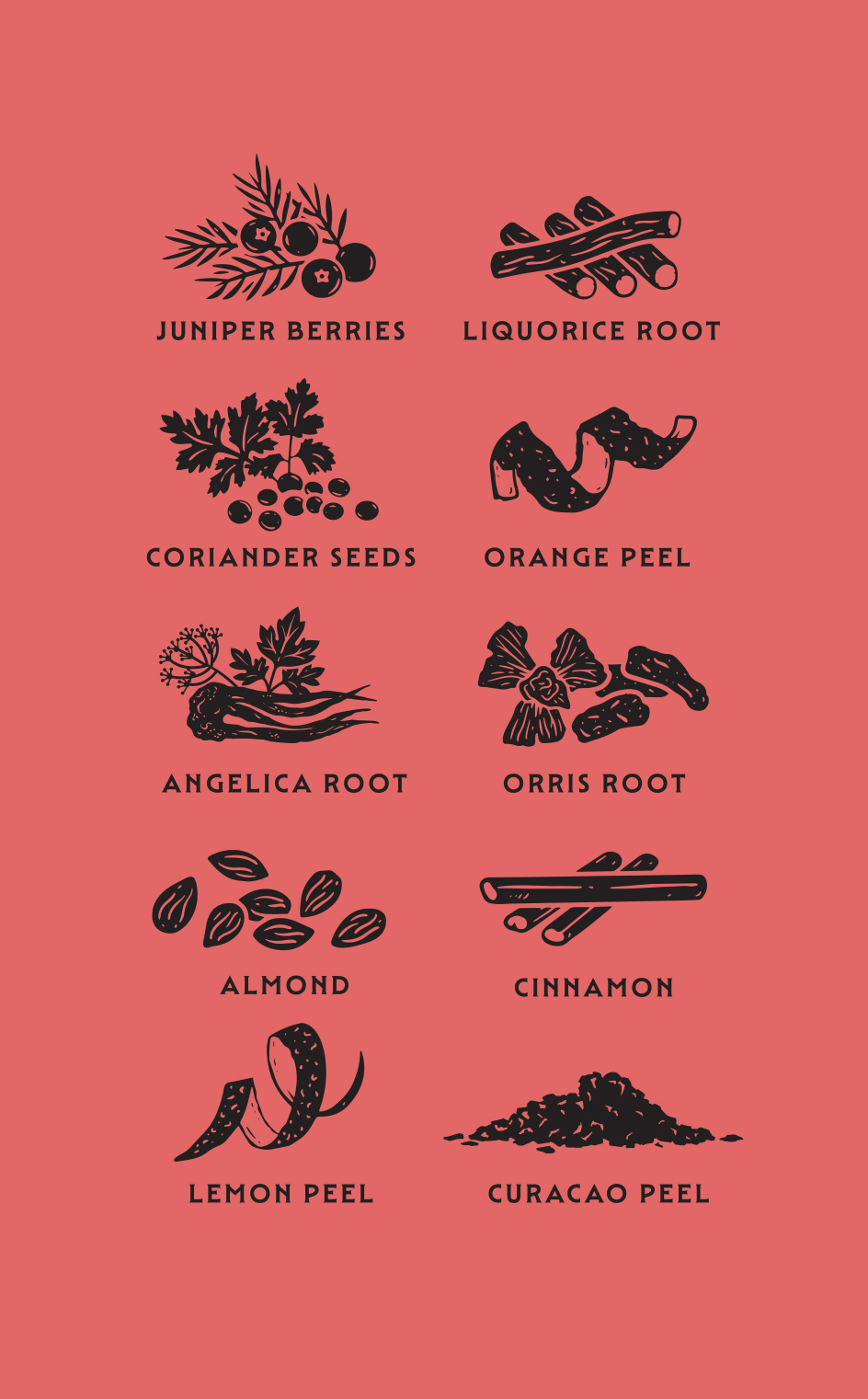
Throughout the presentation, the brand is more playful and connected. The snake, fruit and fronds of foliage are repeated on the neck seal and the secondary label for cohesion. Further differentiation is achieved through a custom bottle, embossed with the copy element: ‘More than a guilty pleasure’.
Brand effectiveness
When the new brand was tested internally at Edgemill, employees instantly found it more appealing and engaging. Compared with its past self, and with other brands on the shelf, Begin now looks very relevant, truly tempting, and hopefully the start of something special
“The feedback to date has been extremely positive to the new packaging. As a business, we are extremely pleased. We have a meeting next week with an Exporter, who is keen to promote Begin Gin!”
–John Sudano, Special Project Manager, Edgemill Group
Credits
Creative direction & design by Ginger Monkey, Tom Lane
Copy & research by Garrick Webster
Bottle visualistions by Boo BY