Carlsberg Branding
-
Lettering + Illustration
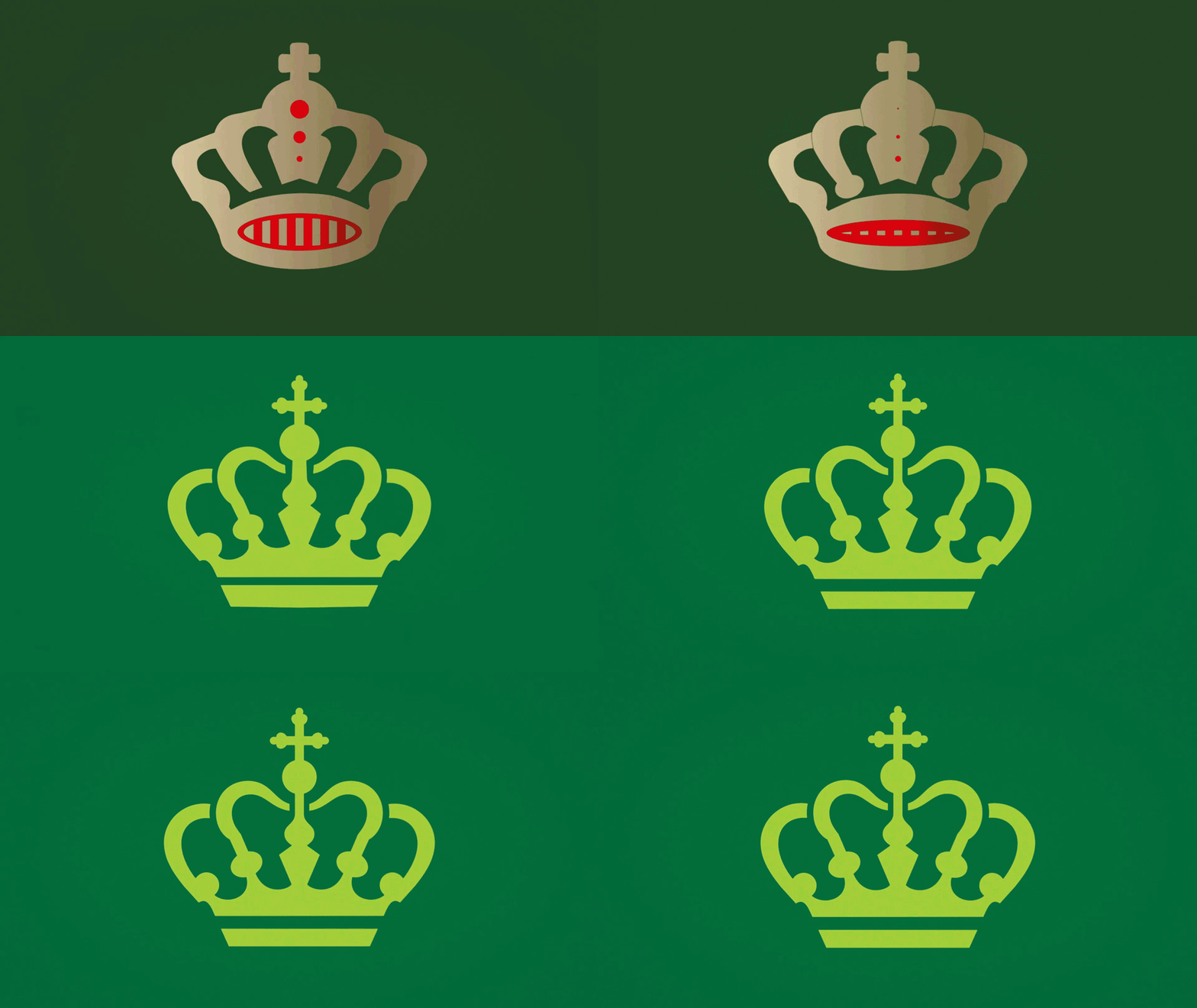
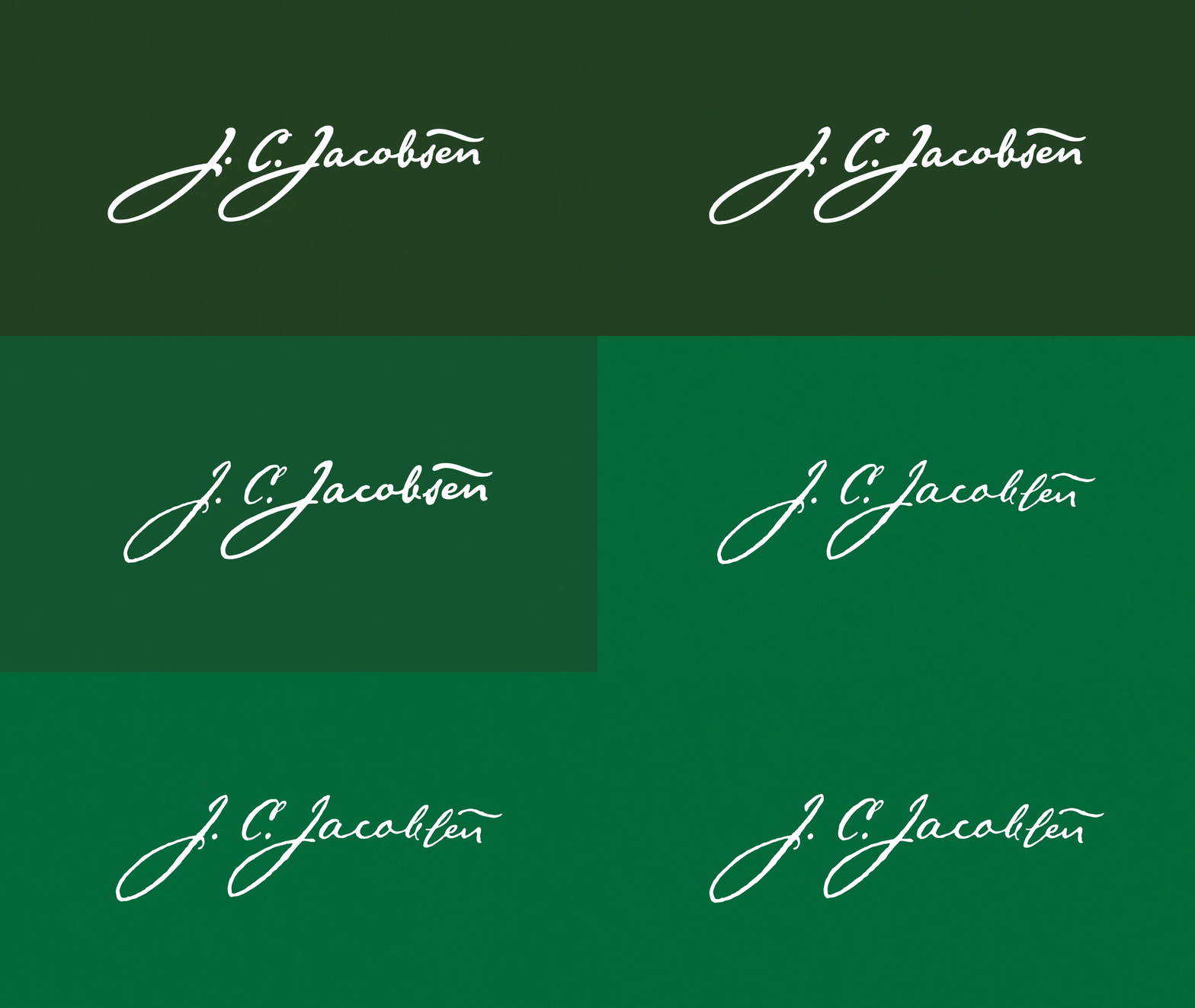
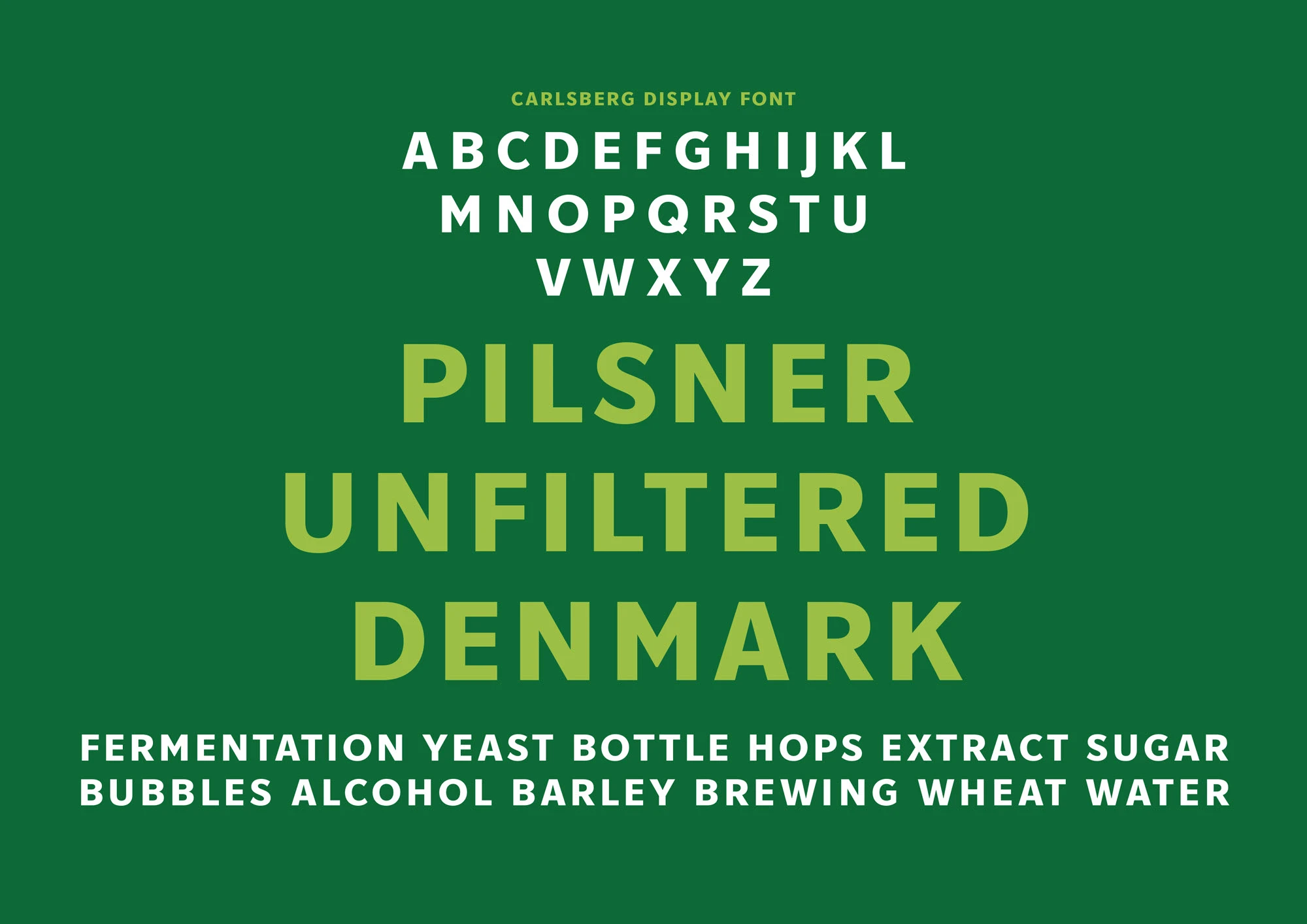
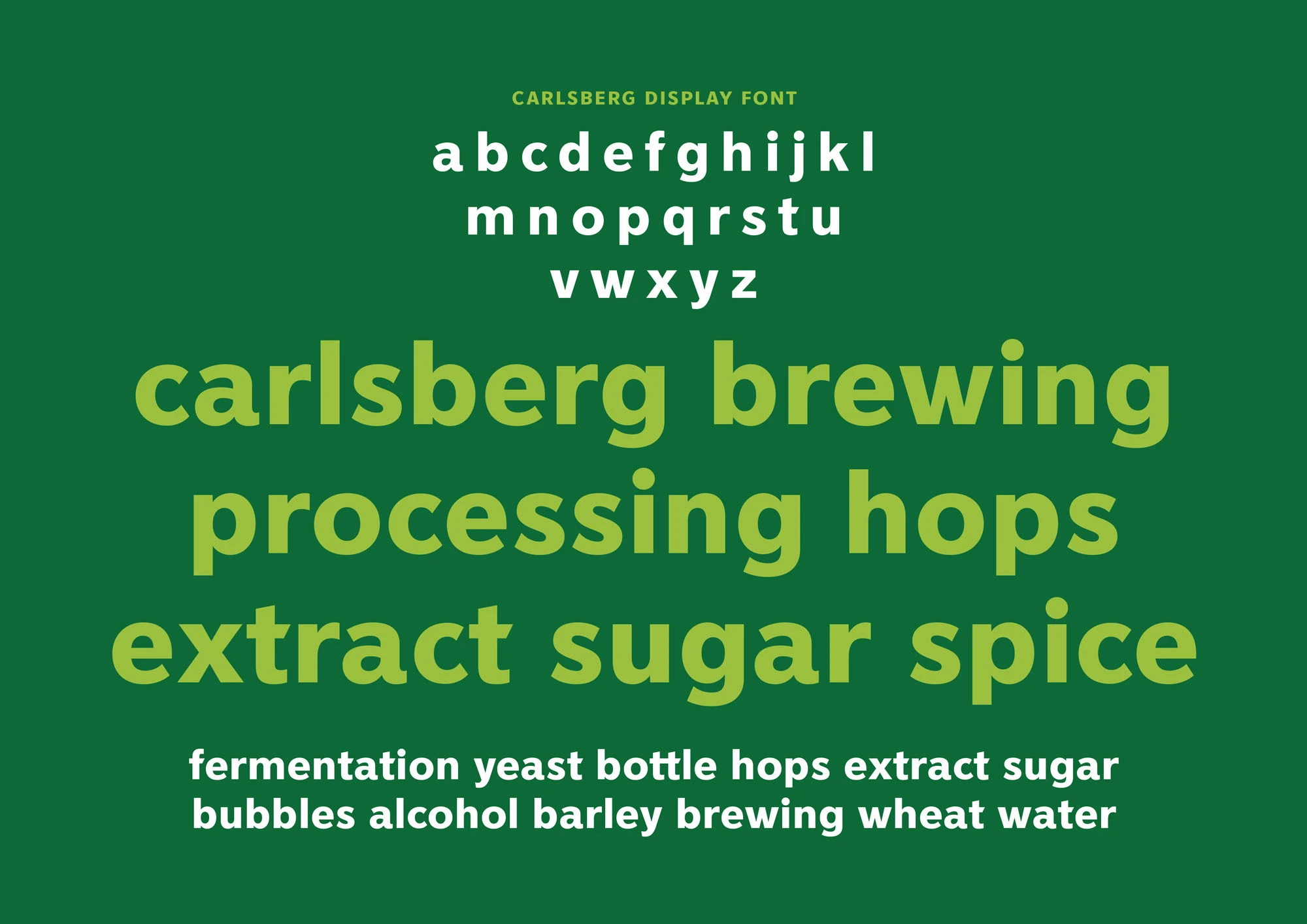
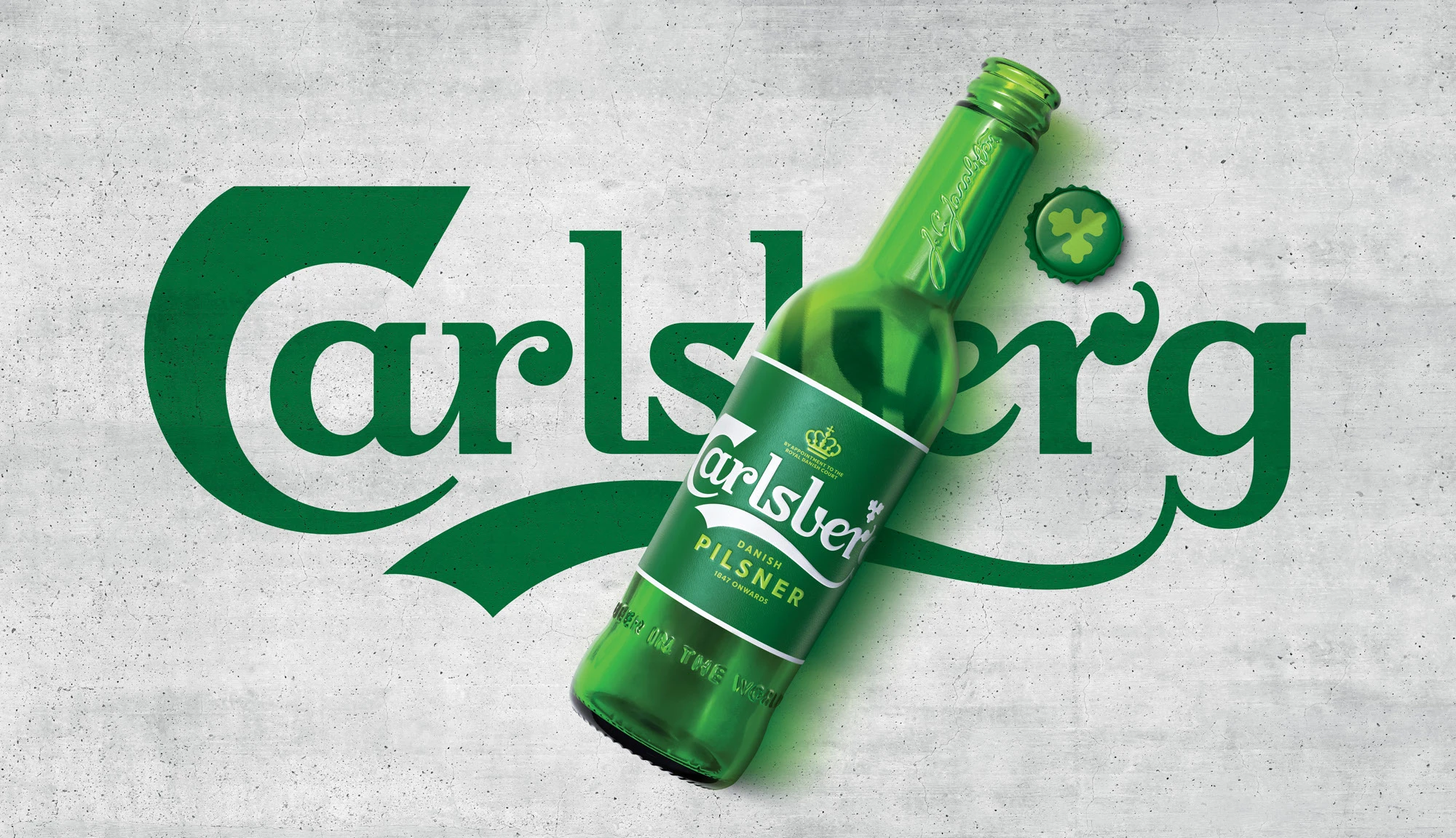
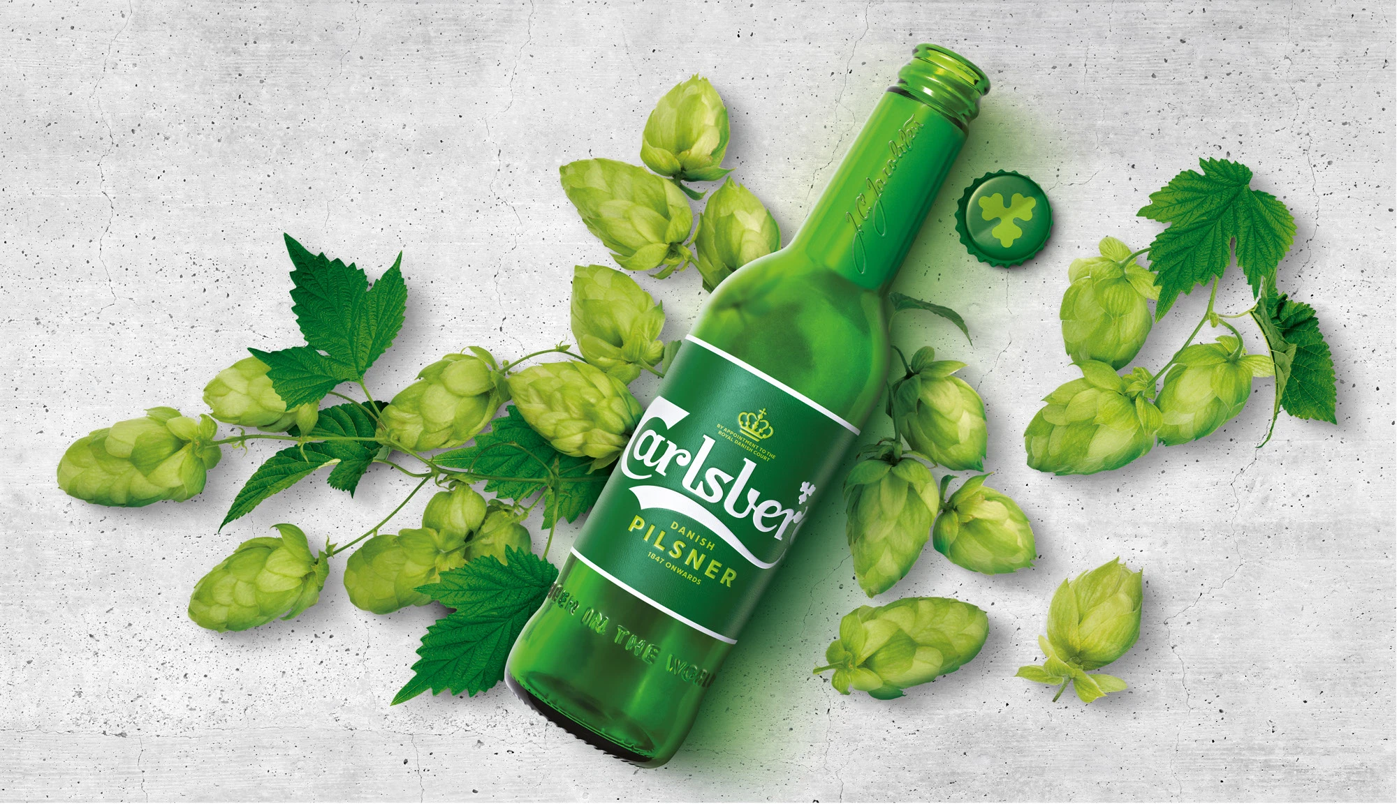
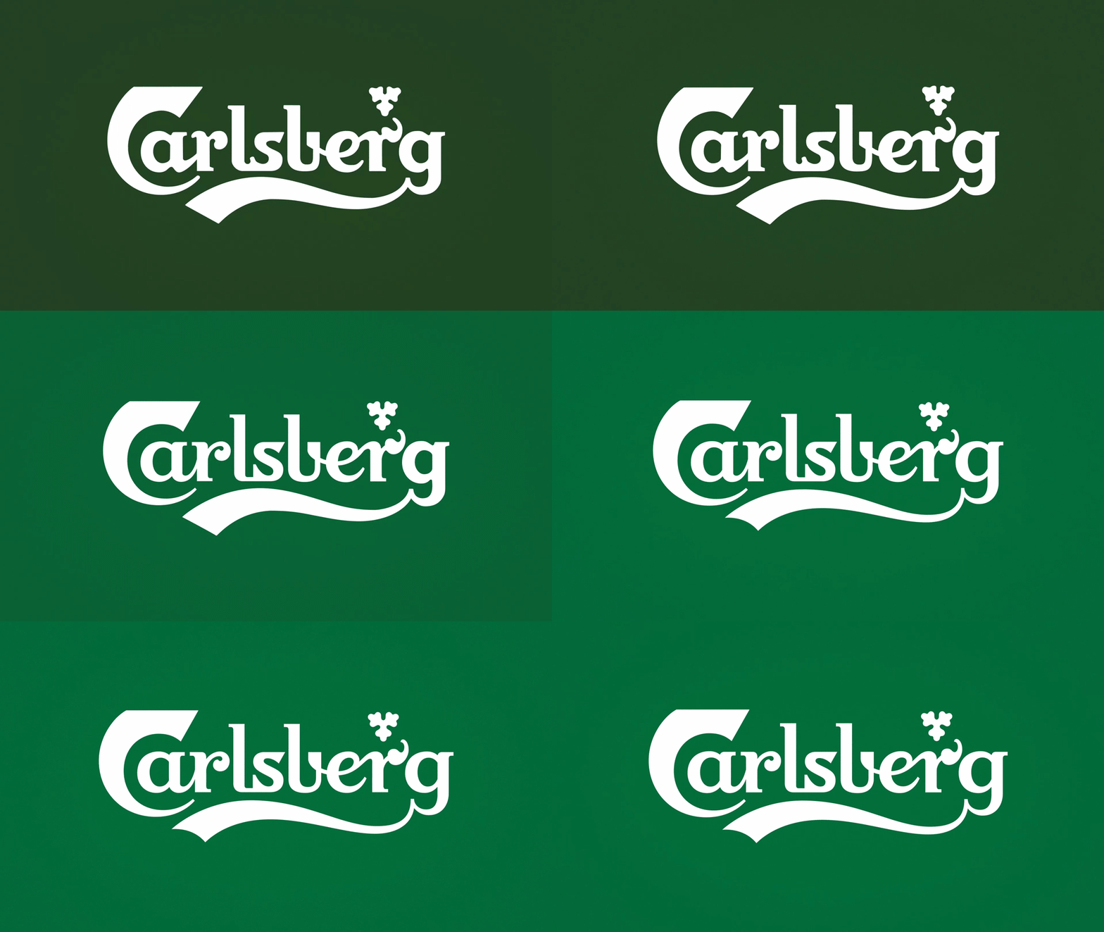
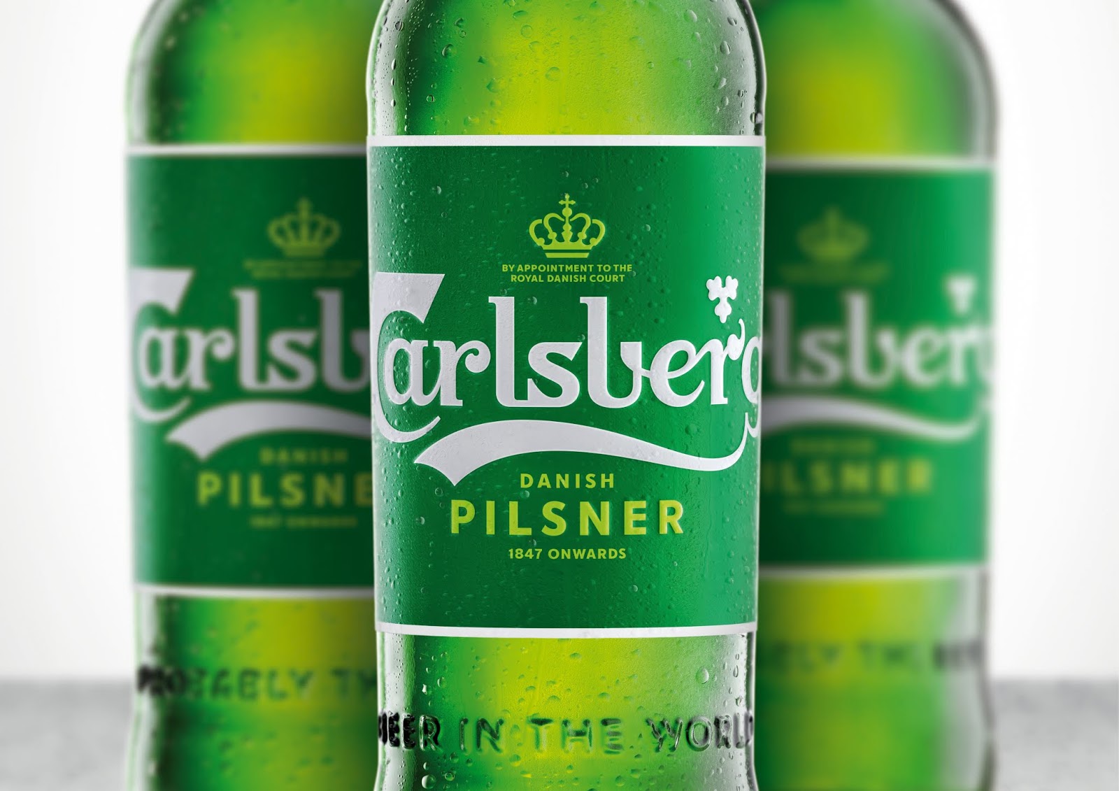
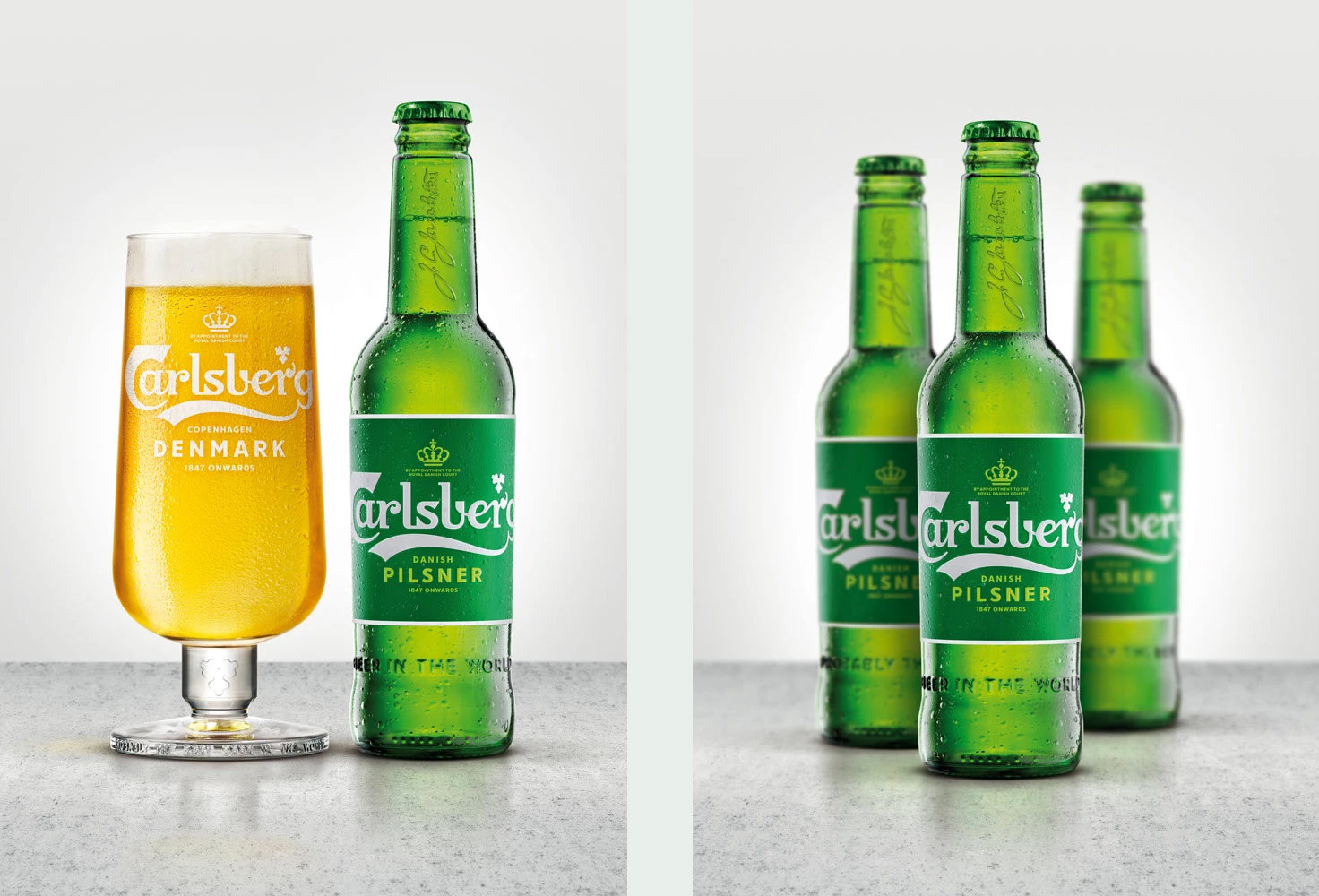
Following extensive research into the brand’s 171-year heritage, Carlsberg’s famous brand elements have been carefully re-crafted for the first time in several years, striking the perfect balance between form and function.
These assets combine to form a coherent master brand-led identity system that works across packaging, promotions and POS materials for all of Carlsberg’s global variants.
Background
Spencer Buck, creative partner at Taxi Studio, says:
"I think the public, when they really get to know Carlsberg, will fall in love with it. Brand's search for purpose is a bit of a buzzword, but it's incredibly important. Carlsberg's had purpose since 1847."
Jacobsen's progressive attitude is encapsulated in the so-called 'Golden Words' from his will: 'In working the brewery we should be in constant pursuit of better beer so that the brewery may always set standards and assist in keeping beer brewing at a high and honourable level’.