Finn Thomson Whisky
-
Lettering + Illustration
-
Brand + Package design
-
Creative Direction

Legacy & Future
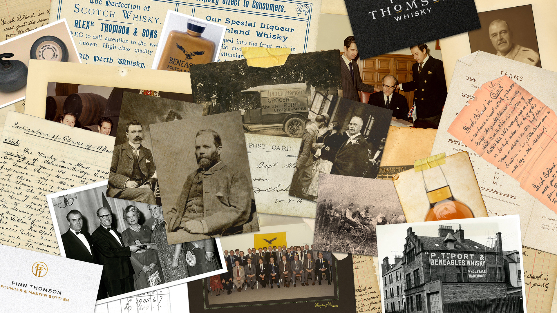
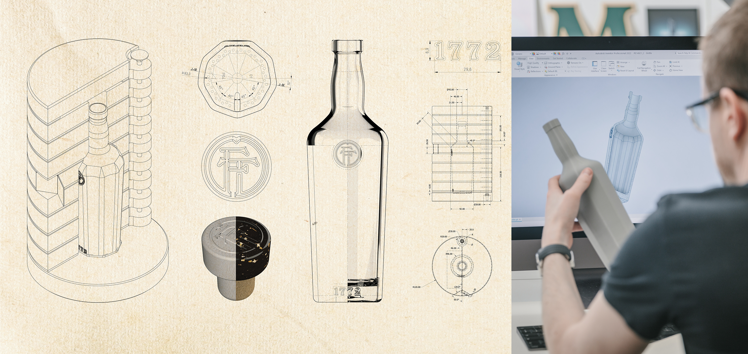
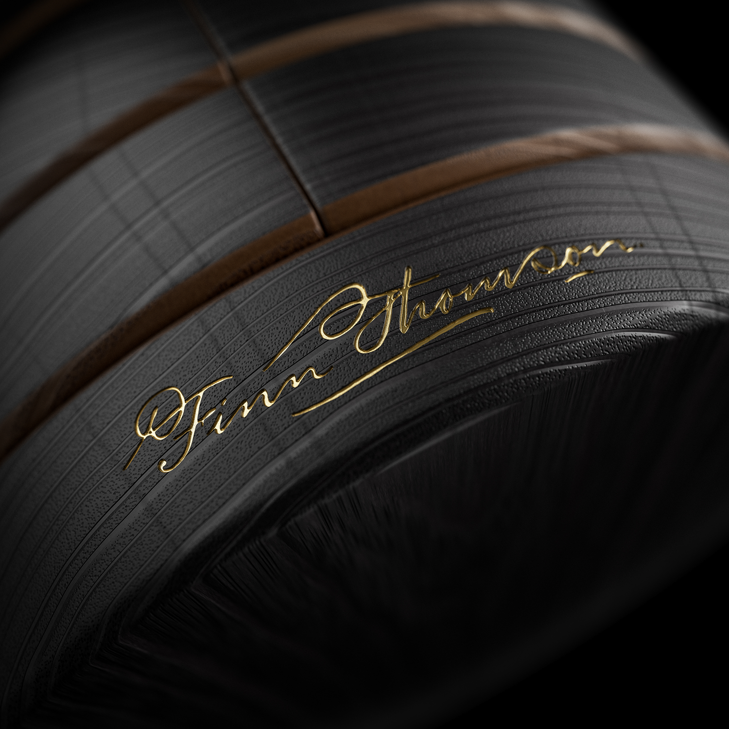
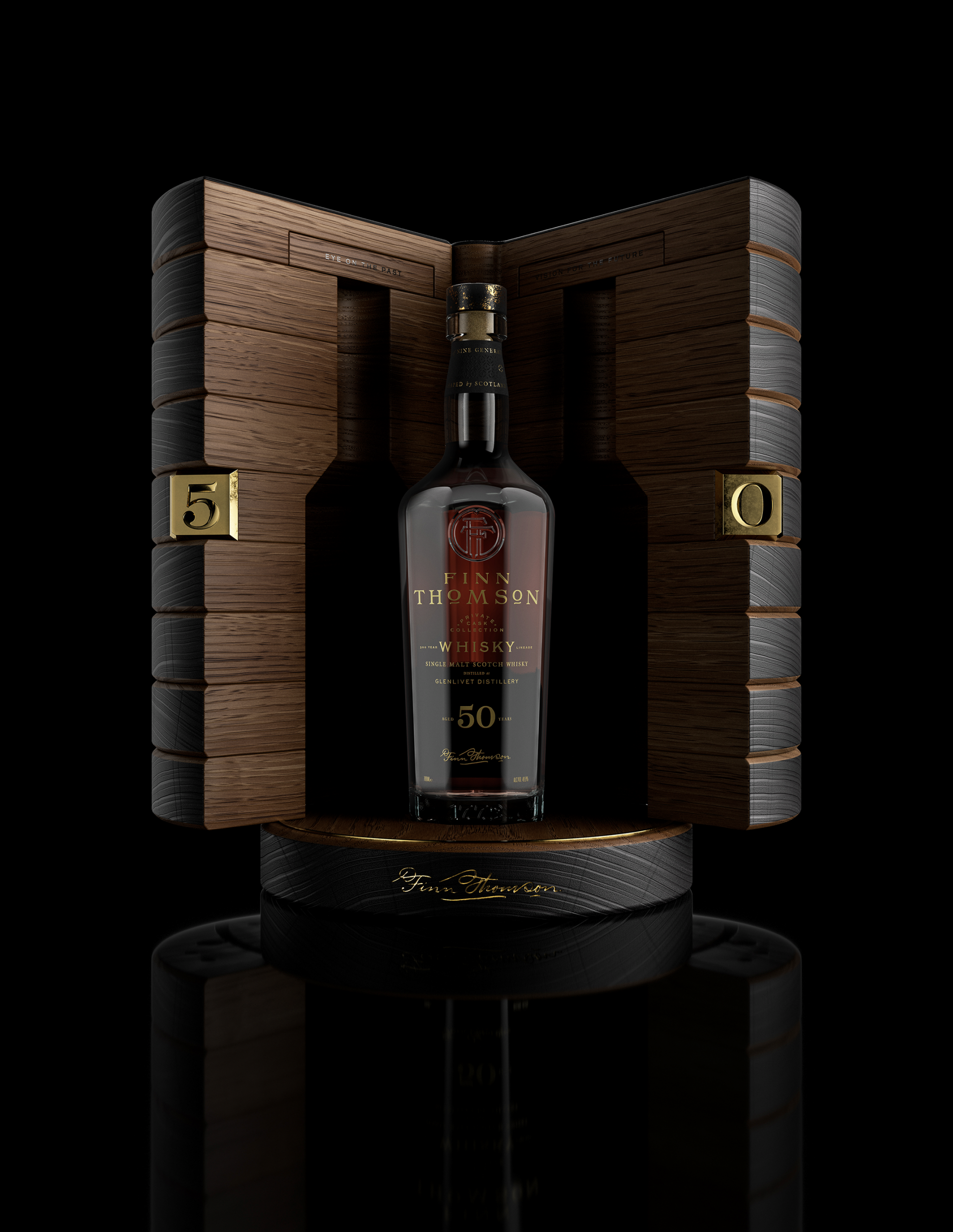
From granite cliffs to peaty glens, Scotland’s ancient landscape inspired the textures that would give the brand its sensory appeal expressed, for example, in the soft, textured paper of the labels and the ceramic stoppers made to fit the custom nine-sided bottle. Exploring the Thomsons’ rich history recorded in old photos, advertising, correspondence, blending notes and receipts, we honed in on certain visual hooks to give the typography a character tied to the family’s past but with the sharpness and clarity required for contemporary appeal. Small details like the dash underneath the Os in the logotype or the flowing cursive of the Finn Thomson signature represent unique, ownable vestiges of the past.


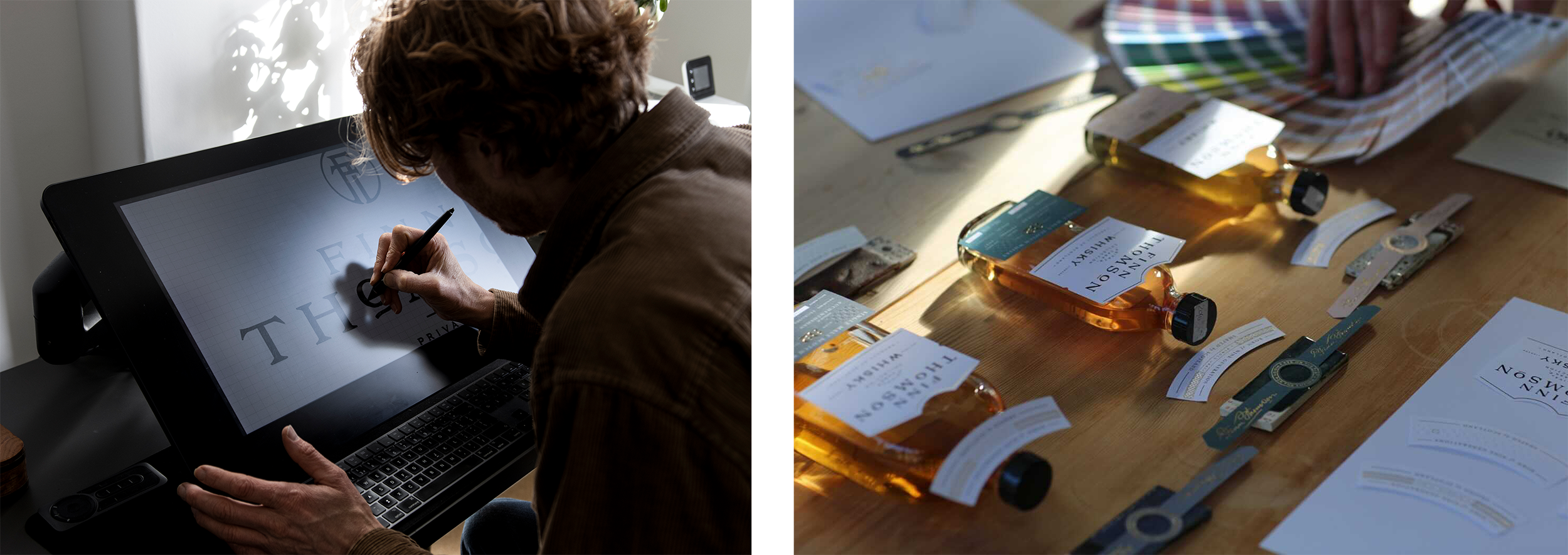


Developing the toolkit and crafting the labels
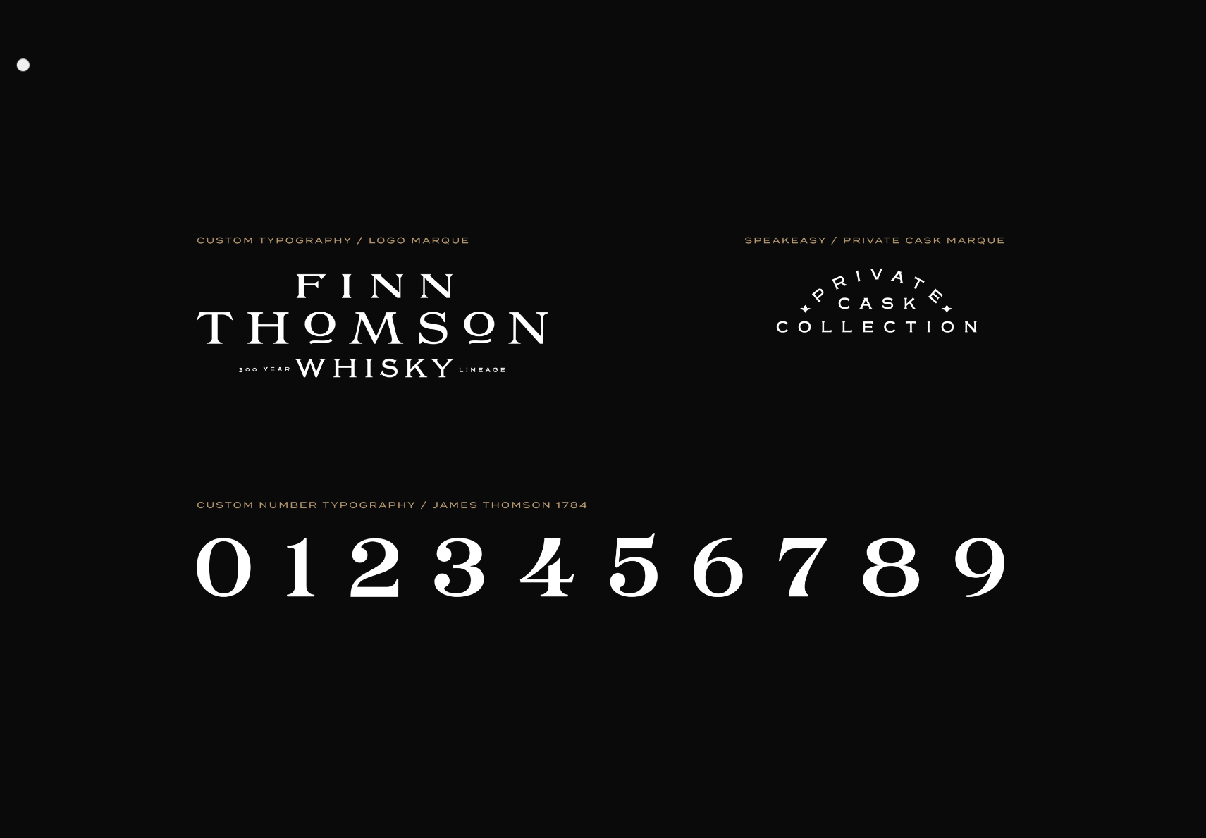
Our specialism in drawing bespoke lettering was key to the development Finn Thomson Whisky brand toolkit. An intelligent monogram mark incorporates the initials of each whisky doyen in the Thomson lineage, layered to result in an artful FT roundel. Two further expressions were hand drawn, covering the main logotype and in label copy, and a separate full set of numerals created for the all-important year and age statements. A speakeasy-style cask mark alludes to the exclusivity of the whisky in every bottle.
The dual label system we formulated is flexible enough to present information consistently across a wide range of age statements, distillery names, cask forms and price points, while being rigid enough to maintain consistency and the brand’s premium quality. The system works in conjunction with the other packaging to differentiate the brand’s hierarchy of Core, Rare and Crown whiskies.

Conclusion
Collaborative branding projects are a pleasure. The outcome is first class, and the project provided the opportunity to see how other creatives approach challenges, generate ideas and solve the problems that arise in the brand development process. Although it is a modern proposition, Finn Thomson Whisky looks like a fully cohesive, living, breathing brand that reaches deep into Scotland’s whisky heritage. If there’s a favourite detail, for us it’s the icon created based on the van Peter Thomson used to deliver whisky across Perthshire back in the 1920s – dynamic, fun and a truly unique expression of the brand.
Creative Direction, Reeve Rixon, Elsk
Creative Direction, Tom Lane, Ginger Monkey Design
Creative Direction, Form Digital
Photography Jonathan Addie
3D Visualisation MAX